If you’re new to design, learning basic design principles explained simply can completely change how your work looks. Whether you’re creating social media posts, websites, presentations, or even posters, these principles help you turn “okay” designs into clean, professional, and eye-catching visuals.
The best part? You don’t need to be an expert. You just need to understand a few simple ideas and practice them consistently.
Let’s go step by step in a detailed, beginner-friendly way.
What Are Design Principles?
Design principles are rules that guide how you arrange elements like:
- Text
- Images
- Colors
- Shapes
- Space
Think of them as a roadmap. Without them, your design may look messy or confusing. With them, everything feels organized and intentional.
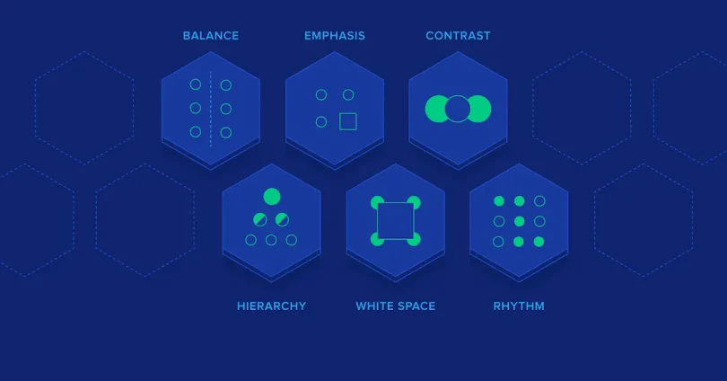
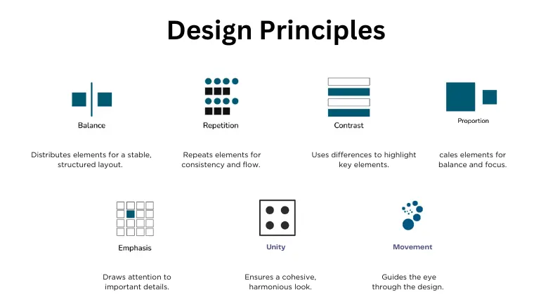
1. Balance – Making Your Design Feel Stable
Balance is all about how elements are distributed in your design. When your design is balanced, it feels comfortable to look at.
Types of Balance:
1. Symmetrical Balance
Both sides are equal, like a mirror.
- Common in formal designs
- Feels clean and structured
2. Asymmetrical Balance
Different elements but still visually balanced.
- More creative and modern
- Example: A big image on one side, smaller text on the other
3. Radial Balance
Elements spread around a central point.
- Example: A circular logo
Beginner Tip:
If your design feels “heavy” on one side, adjust the elements until it feels even.
2. Contrast – Making Important Things Pop
Contrast helps you highlight what matters most.
Without contrast, everything looks the same—and people won’t know where to look.
Ways to Create Contrast:
- Light vs dark colors
- Big vs small elements
- Bold vs thin fonts
- Different shapes
Example:
A bright headline on a dark background instantly grabs attention.
Beginner Tip:
Always make sure your text is easy to read. Low contrast = poor readability.
You may also like it:
Modern Graphic Design Ideas For Beginners and Experts
Top Logo Design Tools Review: Best Logo Makers For 2026
Cheap Graphic Design Tools Deals: Top Picks for Designers
3. Alignment – Keeping Everything Organized
Alignment means placing elements in a clean, structured way.
When alignment is done right:
- Your design looks professional
- It’s easier to scan
- It feels polished
Types of Alignment:
- Left alignment (most common)
- Center alignment (for titles or quotes)
- Right alignment (less common but useful)
Beginner Mistake:
Placing elements randomly. This makes your design look messy.
Simple Rule:
Everything should line up with something else.
4. Repetition – Building Consistency
Repetition means using the same styles throughout your design.
This includes:
- Colors
- Fonts
- Shapes
- Layout styles
Why It Matters:
- Makes your design look connected
- Builds brand identity
- Creates a professional feel
Example:
Using the same button style across a website.
Beginner Tip:
Pick a style and stick with it.
5. Proximity – Grouping Related Elements
Proximity is about placing related items close together.
Why It’s Important:
It helps users quickly understand:
- What information belongs together
- What is separate
Example:
- Title close to paragraph
- Icons close to their labels
Beginner Mistake:
Spacing everything evenly—even when they’re not related.
Simple Rule:
Group related things, separate unrelated ones.
6. White Space – Letting Your Design Breathe
White space (negative space) is the empty space around elements.
Many beginners try to fill every space—but that actually makes designs worse.
Benefits of White Space:
- Improves readability
- Makes design look clean
- Highlights important content
Example:
A simple poster with lots of empty space looks more modern than a crowded one.
Beginner Tip:
Don’t be afraid of empty space—it’s powerful.
7. Hierarchy – Showing What’s Important First
Hierarchy guides the viewer’s eyes.
It tells people:
- What to look at first
- What to read next
How to Create Hierarchy:
- Size (bigger = more important)
- Color (brighter = attention)
- Placement (top = priority)
- Font weight (bold = emphasis)
Example:
- Headline (big and bold)
- Subheading (medium)
- Body text (small)
Beginner Tip:
If everything looks important, nothing is important.
8. Color – Creating Emotion and Style
Color is one of the most powerful design tools.
It affects:
- Mood
- Branding
- Attention
Basic Color Tips:
- Use 2–3 main colors
- Stick to a color palette
- Avoid too many bright colors
Color Meanings (Simple):
- Blue = trust
- Red = energy
- Green = calm/nature
- Black = luxury
Beginner Tip:
Keep colors consistent across your design.
9. Typography – Making Text Look Good
Typography is how your text looks and feels.
Good Typography:
- Easy to read
- Matches your style
- Consistent
Basic Rules:
- Use 2–3 fonts max
- Use bold for headings
- Keep spacing readable
Font Pairing Example:
- Heading: Bold modern font
- Body: Simple clean font
Beginner Mistake:
Using too many fancy fonts.
10. Simplicity – Less Is More
One of the most important parts of basic design principles explained simply is keeping things simple.
Too many elements can:
- Confuse users
- Reduce clarity
- Look unprofessional
Simple Design Rule:
Ask yourself:
“Does this element really need to be here?”
If not, remove it.
How All Principles Work Together
These principles are not separate—they work together.
For example:
- Contrast + Hierarchy → highlights key message
- Alignment + Proximity → creates organization
- White space + Simplicity → improves clarity
When combined, your design becomes:
- Clean
- Clear
- Professional
Common Beginner Mistakes to Avoid
- Overcrowding the design
- Using too many colors
- Poor alignment
- Ignoring white space
- Using too many fonts
- No clear hierarchy
Avoiding these mistakes can instantly improve your design.
Practical Example (Simple Breakdown)
Let’s say you’re designing an Instagram post:
- Use hierarchy for headline
- Apply contrast for readability
- Keep alignment clean
- Use repetition for colors/fonts
- Add white space for clarity
- Keep everything simple
This is how basic design principles explained simply work in real life.
Final Thoughts
Learning basic design principles explained simply is the foundation of great design. You don’t need expensive tools or years of experience—just a clear understanding of these ideas and regular practice.
Start small. Apply one principle at a time. Over time, your designs will naturally improve.
Remember:
Good design is not about adding more—it’s about using less in a smarter way.
FAQs – Basic Design Principles Explained Simply
1. What are basic design principles explained simply?
Basic design principles explained simply are easy-to-understand rules that help you create clean, balanced, and visually appealing designs. These include balance, contrast, alignment, repetition, proximity, white space, hierarchy, color, typography, and simplicity.
2. Why are design principles important for beginners?
Design principles help beginners:
Avoid messy layouts
Improve readability
Create professional-looking designs
Communicate ideas clearly
Without these principles, designs can look confusing and unorganized.
3. What is the most important design principle for beginners?
Simplicity is often the most important. When you keep your design simple:
It becomes easier to understand
It looks clean and modern
Your message stands out
4. How can I improve my design using basic principles?
You can improve your design by:
Using fewer colors and fonts
Aligning all elements properly
Adding white space
Creating clear hierarchy
Keeping related items close together
Practice applying one principle at a time.
5. What is the difference between contrast and hierarchy?
Contrast makes elements different (like light vs dark)
Hierarchy shows importance (what comes first, second, etc.)
Both work together to guide the viewer’s attention.